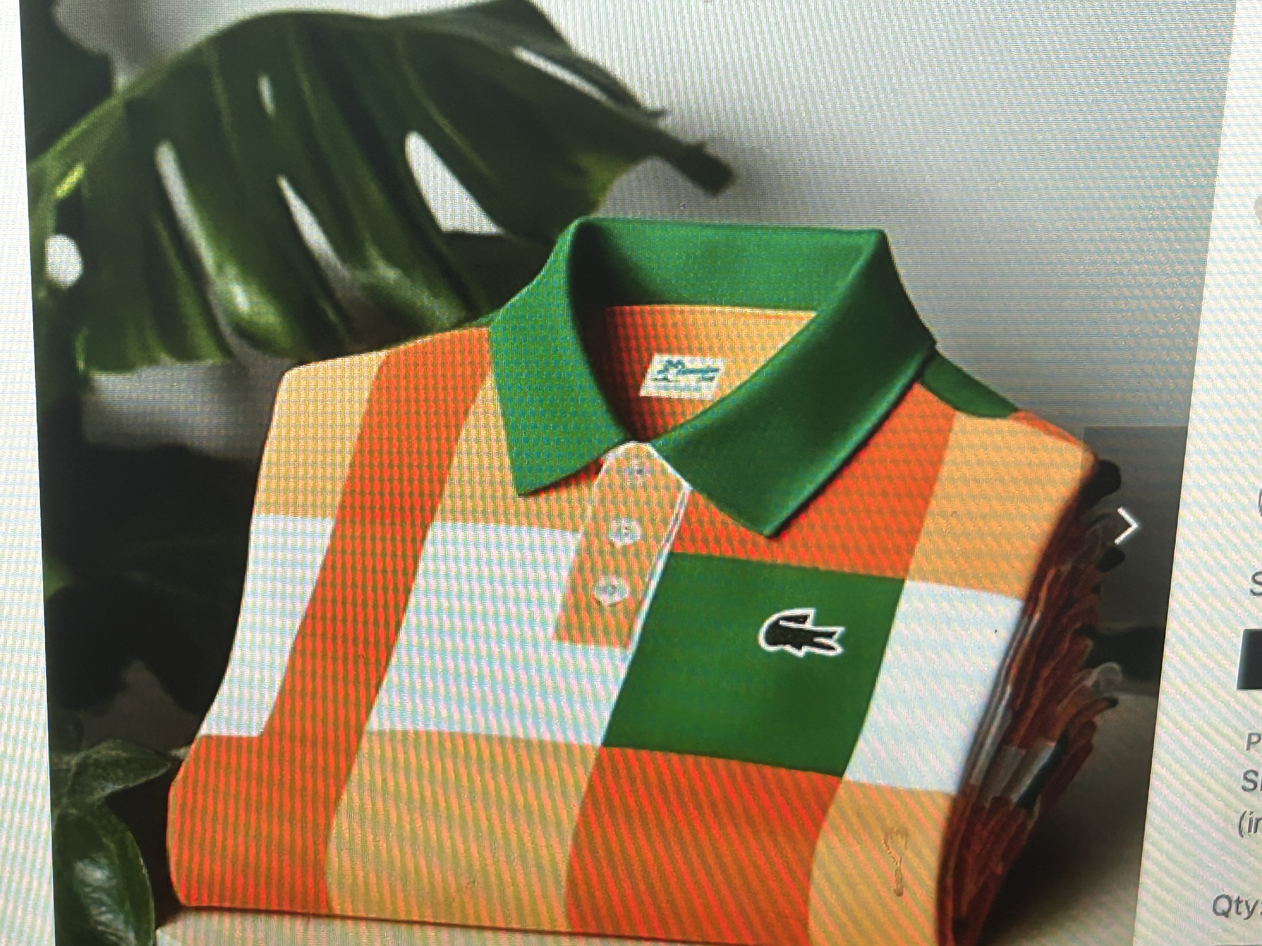
First it is important to know that I hate the color orange. It hurts my eyes every time I see it. So the above shirt had one strike against it to begin with. But, upon closer inspection, it just gets worse. Orange, as I have said, is a problem for me but the combination of green, white and orange is ghastly. Then the patterns are inconsistent in a way that makes the shirt look poorly put together. You have orange line running down the left side of the shirt surrounded by squares, except for the one section where the buttons are which looks like a sideways Utah and gives the appearance of being wonky and amateurish. This is a horrible looking shirt that I can only see senior golfers wearing when the nicer shirts are at the bottom of the dirty cloths basket. A definite no from me.
